← Writing / interpretability · shap · lightgbm · text-classification
Important is not the same as useful
I call the series Model forensics, because that is what interpretability turns into once you push past the bar chart: the model has left evidence everywhere, and the work is reading it. This post judges the features. Part 2 stress-tests the classes. Part 3 interrogates the labels.
A confusion matrix told me two of my 77 classes trade seven mistakes between them — and nothing about why. The answer took three posts to write down: compositions on top of SHAP, the method that splits a prediction into per-feature contributions. The model is deliberately boring — TF-IDF plus LightGBM, 86% accuracy on the BANKING77 intent dataset — because boring models give exact SHAP values and features you can read. This part covers the cheapest composition: the same importance numbers normalized two ways, which together prove a feature can be important without being useful, and sort all 10,296 features into four buckets, each with its own action. The strangest thing that fell out: my model reads punctuation.
01 — 86% accurate, and stuck
The setup: BANKING77, a public dataset of 13,083 customer messages sorted into 77 banking intents. Features are TF-IDF — word counts weighted by rarity — plus four structural ones I added by hand (word count, question mark, exclamation count, uppercase ratio). 10,296 features total, fed to LightGBM, a gradient-boosted tree model. Test accuracy 86%, macro F1 0.86 — the per-class average, so small classes weigh as much as big ones. Fine-tuned transformers reach about 93% here. I wasn’t chasing the leaderboard; trees give exact SHAP and features a human can read.
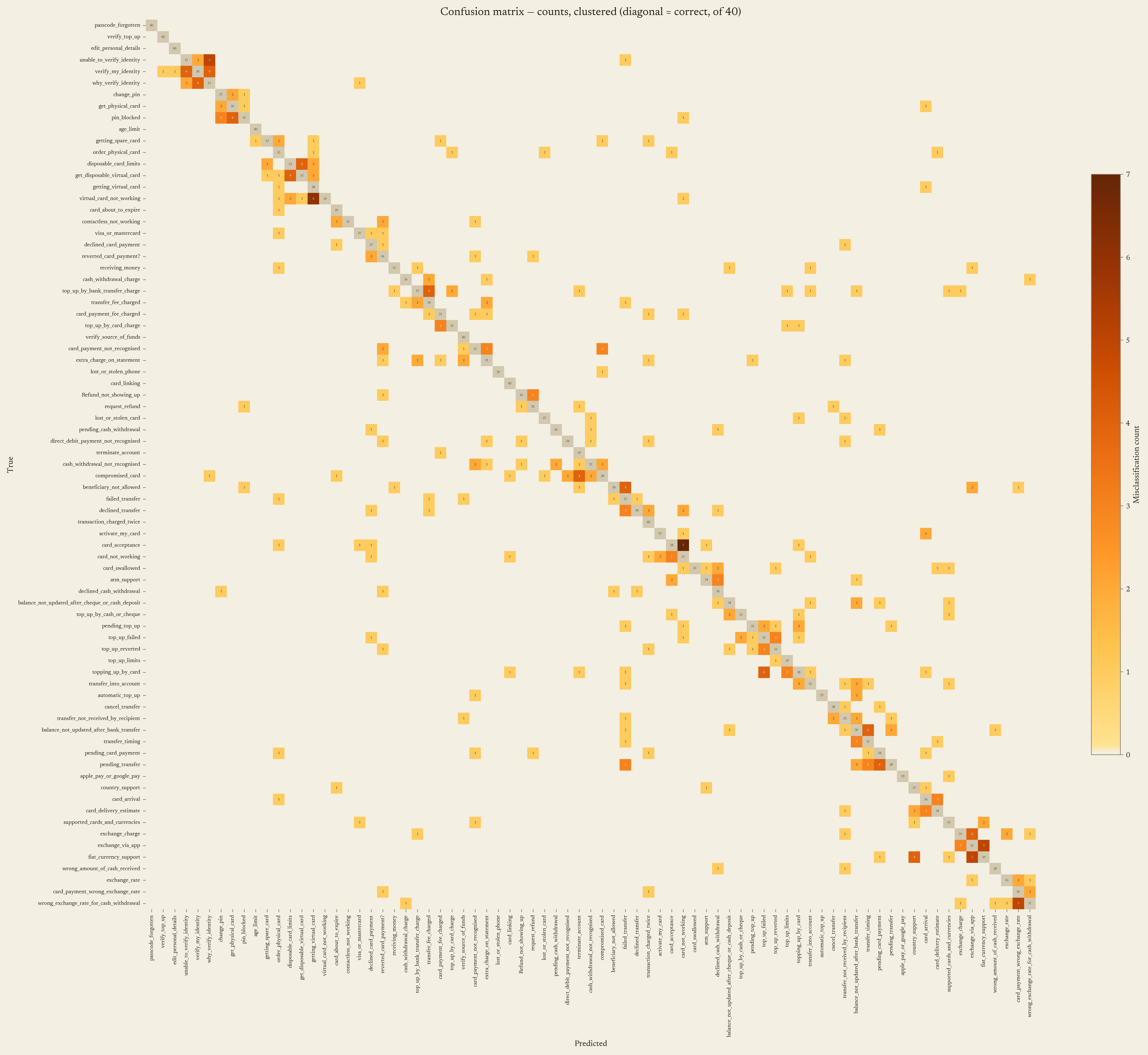
The confusion matrix is where the trouble starts. Most of it is a clean diagonal. The errors cluster in neighborhoods — card classes confused with card classes, transfers with transfers.
Zoomed in on eighteen of the classes this series keeps returning to, running pair outlined:
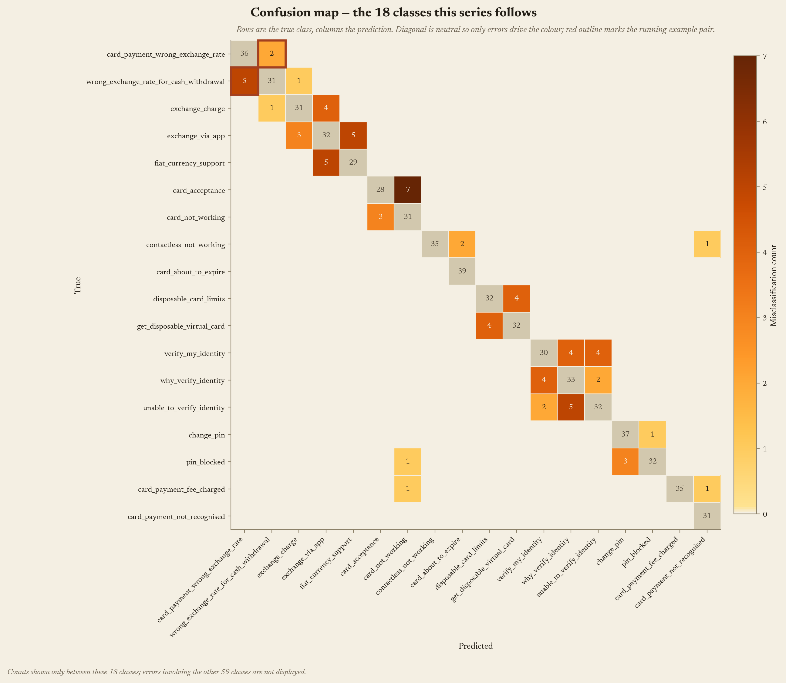
And one pair kept trading mistakes: card_payment_wrong_exchange_rate and wrong_exchange_rate_for_cash_withdrawal. Seven errors between them. Same problem, different channel.
The matrix says these two are confused. It cannot say why. Seven misclassifications, zero mechanism. This is where a lot of projects stall: the metric points at the problem and offers nothing to act on.
02 — What the model pays attention to
SHAP assigns every prediction a per-feature breakdown. Average the absolute values per class and you get a matrix: how strongly each feature influences each class.
The full matrix is 10,296 features × 77 classes — unprintable — so below is a hand-picked 16 × 14 cut. The selection rule is simple: every feature and class shown gets interrogated somewhere in this series. The numbers are real.
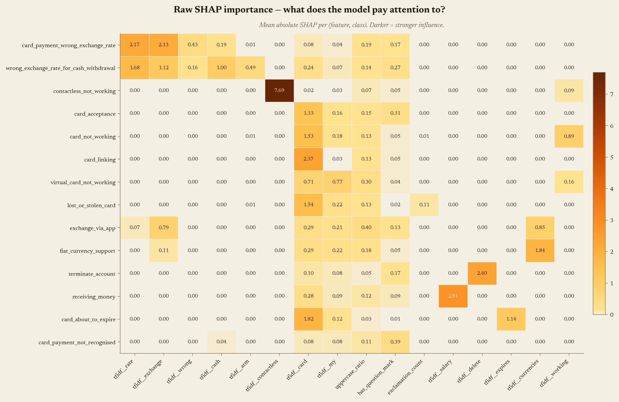
Start with the exchange-rate pair — the top two rows. Both lean hardest on the same two words: “rate” (2.17 and 1.68) and “exchange” (2.13 and 1.12). Only the quiet columns differ: the withdrawal class also registers “cash” at 1.00 and “atm” at 0.49, where the card-payment class shows 0.19 and nothing. The confusion is already less mysterious — the model hears the same loud words in both. What it does with the quiet ones is part 2’s story.
Two more patterns. contactless_not_working has one dark cell — tfidf__contactless at 7.69 — and almost nothing else. terminate_account leans on tfidf__delete at 2.40. Meanwhile tfidf__card is moderately dark in nearly every row: 1.82 for card_about_to_expire, 1.53 for card_not_working, 1.33 for card_acceptance.
So is “card” the model’s most valuable feature, or its least? The raw view can’t answer that.
A feature can be important without being useful.
03 — Who owns each word
To separate important from useful, change the question: take each feature’s total SHAP mass across all 77 classes and ask what share each class owns. The chart below shows that ownership view, with 14 of the 77 rows displayed.
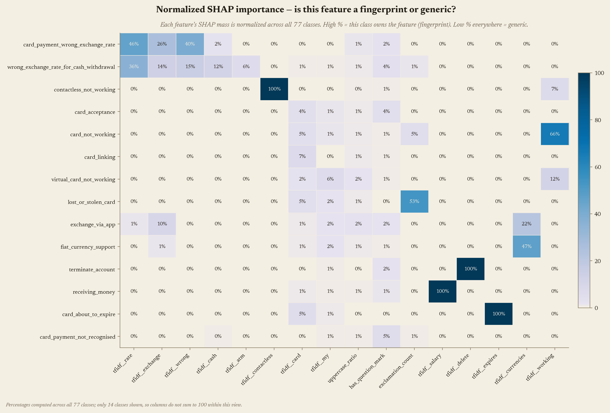
Now the roster is unambiguous. Four words have a sole owner at exactly 100%: contactless, delete, salary, expires. See one of them and you know the class. That is a fingerprint — the forensic kind: one pattern, one suspect.
And the anchors collapse. tfidf__card tops out at 7% ownership — at card_linking, its best class anywhere. tfidf__my peaks at 6%, at virtual_card_not_working. Present everywhere, owned by no one.
The heatmap is also leaking an answer I’m saving for part 2.
The exchange-rate pair doesn’t just lean on the same loud words — it co-owns them: “rate” splits 46% / 36% between the two, 82% of everything the model knows about that word, held by exactly the two classes that keep mistaking each other. “wrong” splits 40% / 15%, “exchange” 26% / 14%. One scale down, “currencies” splits 47% / 22% between fiat_currency_support and exchange_via_app — which turns out to be the other pair that confuses most. Shared custody of words, shared mistakes.
One admission before moving on: my first version of this chart normalized the wrong axis — each class row summed to 100% within the visible columns — and I read fingerprints that weren’t there. Same numbers, wrong denominator, confident nonsense. Normalize down the wrong axis and the chart answers a different question than the one you asked.
04 — Four quadrants, four actions
Cross the two views and every feature lands in one of four quadrants, each with its own action.
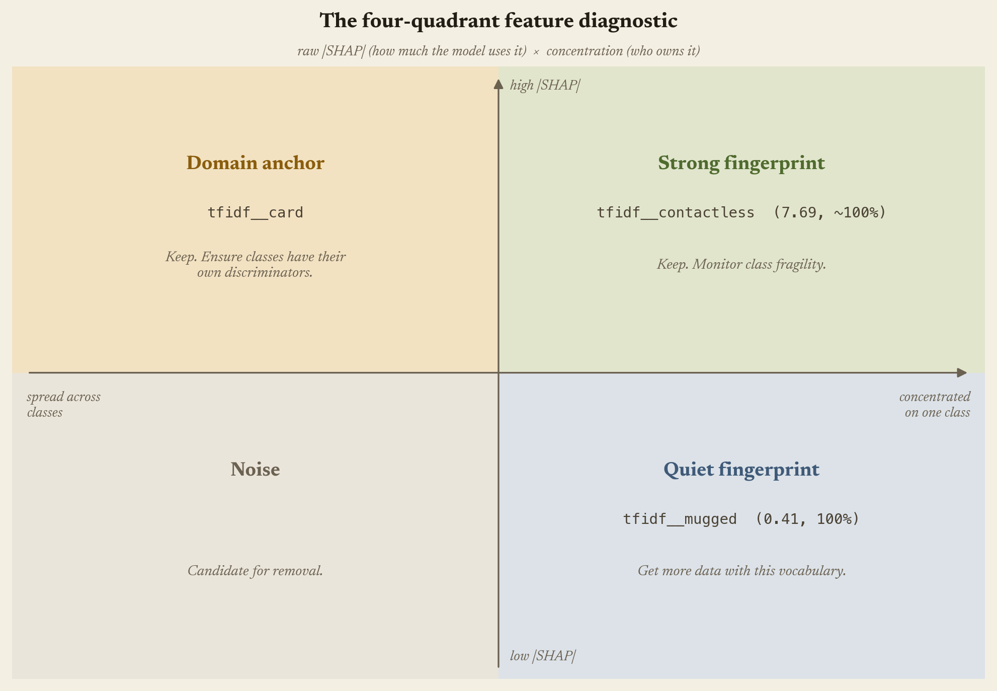
Strong fingerprint — high raw, high ownership. tfidf__contactless: 7.69, 100%. Keep it. But a class leaning this hard on one word is exposed, and part 2 measures how much.
Quiet fingerprint — low raw, high ownership. tfidf__mugged: 0.41, 100% owned by lost_or_stolen_phone. The specificity is there; the volume isn’t. Action: collect more training data with this vocabulary and its synonyms.
Domain anchor — high raw, low ownership. tfidf__card. Deleting it because it’s “generic” would be wrong: it narrows 77 classes down to the card neighborhood. It just can’t finish the job. Action: keep it, and check that each class in the neighborhood has a fingerprint of its own for the last step.
Noise — low raw, low ownership. No signal, no specificity. Candidate for removal.
The test I actually cared about: my own four engineered features, measured across all 77 classes rather than read off the heatmap. word_count peaks at 6.7% ownership and sits in the top-20 of 30 classes. has_question_mark: 6.1%, 25 classes. uppercase_ratio: 10.1%, 66 classes. Three domain anchors — broad, shallow, worth keeping, not worth expecting miracles from. Thirty seconds per feature to grade my own feature engineering. The fourth one broke the pattern.
05 — The model reads punctuation
Look back at the heatmaps. One column has been sitting there quietly the whole time: exclamation_count, one of my four structural features. And one row I haven’t mentioned: lost_or_stolen_card. In the raw view that row reads as a card class — tfidf__card at 1.54, the exclamation cell a footnote at 0.11, fourteen times smaller. Every importance instinct says the word matters and the punctuation is noise.
The ownership view inverts the row. “card” collapses to 5% — its mass belongs to the whole card neighborhood. The exclamation counter jumps to 53%, the feature’s highest share across all 77 classes, and the only class where it cracks a top-20. Raw says this class is about cards. Ownership says this class is what an exclamation mark means. Same row, opposite conclusions. Here is where the rest of the feature’s influence goes:
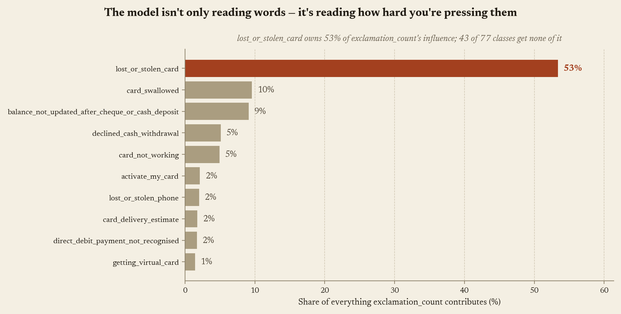
The runners-up lean the same way: card_swallowed, balance_not_updated_after_cheque_or_cash_deposit, declined_cash_withdrawal, lost_or_stolen_phone — moments when money or cards go suddenly missing. The model reads punctuation. People in trouble press the keys harder — “My card was stolen!” — and it learned the pressure, not only the words (this class also tops all 77 in actual exclamation marks per message).
A structural fingerprint I never designed on purpose — and the post’s title, sitting in a single row of the chart. Important is not the same as useful.
Dataset: BANKING77 (Casanueva et al., 2020), CC BY 4.0. Model, code, and all figures are mine.